| Green - Available Red - Unavailable |
Saturday, 13 January 2018
Weekly Review:
Thursday, 11 January 2018
Production Call Sheet:


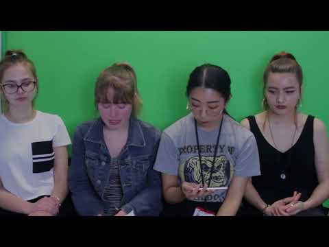
The production sheet outlines each members role within the group and within shoots. It will be essential to refer back to this to help keep us on track and so that we know what we have done and are yet to do as well as making it clear what we need for each shoot.
Since making this though there have been some changes and kelly will now be playing the actress within the music video for scheduling reasons as it is more time effective to use her and will make it easier for digipak and poster shoots.
Wednesday, 10 January 2018
Digipak Research:
Digipak- style packaging is usually used for CD singles or albums, they usually consist of gatefold paperboard or card stock outer binding, with one or more plastic trays holding a CD. This is an example of a digipak template:

A successful digipak can be achieved by making sure these points have been referred to:
- Unification, does it portray the content and message that you wish?
With this connection, the audience can feel a sense of belonging to the artist, forming a relationship. This cam be said to be stronger with females (known as fangirls), but it can be formed with anyone if the branding directs the audience directly.
- Is there an information and visual hierarchy?
The main image is the first thing that the audience will focus on, therefore it should be impactful. After this has attracted the attention of the audience member, they will look over the rest of the graphic and take in the connotations and feelings portrayed by the artist.
- Does the design have graphic impact?
The graphic design is important as it needs to have an impact. This is because the CD will need to be able to compete alongside many other CDs, and ours will need to have something special and original to make it stand out so other music labels will take an interest in your music and style.
- Is it appropriate for when you want to attract an audience and the environment in which it will be presented?
Not reaching your target audience will mean that sale targets and recognition will not be achieved.
An example of an iconic logo that stands out is the Rolling Stones' logo, which became one of the most recognisable symbols of the rock genre. It captures the brands rebellious attitude in pushing both sexual and social norms in both their lyrics and off stage antics. It was a key piece of iconography which allowed the brand to be recognised with out their name on their albums.
The Golden Era of cover art design begun in the early 1960s and lasted until the 1980s. During this time the major format for music was the 12 inch play disc or LP. Cover art became a part of the musical culture of the time, Often used to express graphically the musician's artistic intent, it helped connect and communicated to listeners the message or underlying theme of the album.
Tuesday, 9 January 2018
Outfit Moodboard:

Kelly (in charge of Mise-en-Scene) created a moodboard for our artist, following street style, with a retro/vintage vibe. The outfits are casual yet stylish, neither extravagant or plain - which what we aim to achieve with Raina's outfits and image, as it also shows her interest in the arts. We are certain that Raina will be wearing a beret throughout the music video, and that it will be her trademark, which links to her French origins. Her clothes will have cool-tones and dark colours, which suits nightlife she will be in, and also allows her makeup to stand out.
From this we will gather possible outfits and make a poll voting which outfit would suit her the best (with our artist wearing the outfits).
Props do not play a significant role in the music video because of the genre (electro-pop), the only props that are involved are interactive ones - being the things the artist naturally comes across/are in the location already. For example, food/drinks, doors, the game machines; this is because the main focus of the music video is the visuals.
Sunday, 7 January 2018
Poll Results:

We handed out the fonts that we were considering to a group of 10 people of a similar target audience age (the majority were 17/18) this would be able to highlight which font would attract an audience of that age group the most.

The font that was the most popular was the one above, therefore this is the font that we will be using in our music video and digipak, it will be purple as that is the colour we are associating with our artist and it will help it to stand out amongst the location shots
Saturday, 6 January 2018
Friday, 5 January 2018
Logo ideas:


These are the choices of fonts that we all agreed upon since they are quite artistic and they will link well with our artist and the audience that we are targeting. These will be used throughout our music video and will transition nicely into the other shots we will have using neon lights and purple effects.
We will hold a poll to determine which font is favoured by an audience similar to our target age.
Subscribe to:
Posts (Atom)
Evaluation Question :
How did you use media technologies in the construction and research, planning and evaluating stages? My segment part cut out rig...
-
How did you use media technologies in the construction and research, planning and evaluating stages? My segment part cut out rig...
-
 The production sheet outlines each members role within the group and within shoots. It will be essential to refer back to this to help...
 -
The culture industry: Adorno and Horkeimer adopted the term 'culture industry' to argue that the way in which cultural items were ...
